Whenever I see a very pretty poster or book cover, I am immediately drawn in. Unfortunately the adage « do not judge a book by its cover » is one that is lost on me, as I am a magpie drawn in by shiny pretty things. And as an art historian, I am very much of the opinion that style IS substance, and that there is much to draw from the way things look. When there is a pretty poster advertising a movie to me, I often stop and pay attention, and while it might not always get me to watch the movie, it will definitely make me think about doing so. After all, there are people whose job is to design posters and covers, and that is as much a worthwhile work of art as the book or movie in itself.
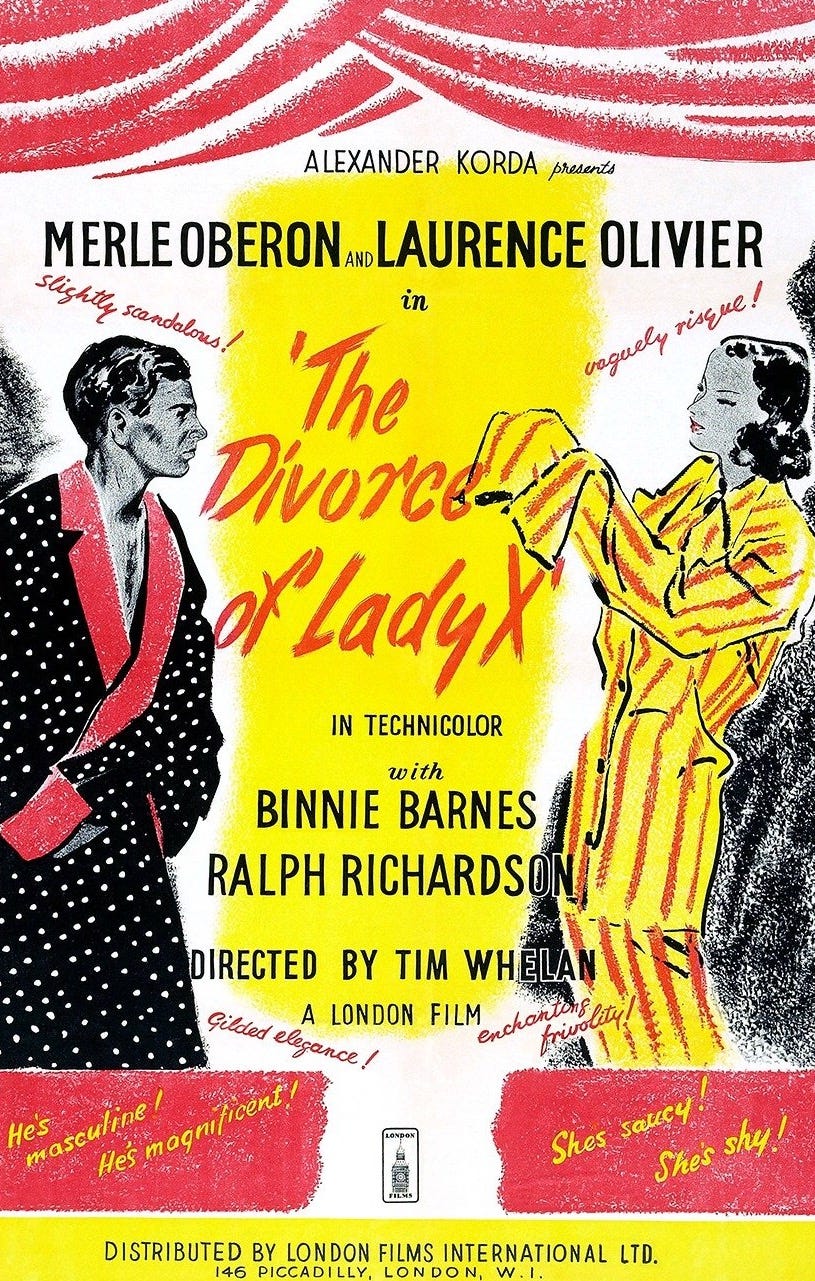
The illustrations for the promotional material for The Divorce of Lady X, a 1938 movie produced by United Artists and London Film Productions. In the 1930s, a lot of the promotional and advertisement used to be still illustrated. However, considering that the focus was not on the illustrators, that they were often either freelancers or in-house employees of the studios, there is often very little information about the illustrators and the artists. Which means that we are going to don our trench coats and little magnifiers, and get a creative to try and investigate who was the artist, or perhaps artists who created these illustrations.
The Divorce of Lady X was a technicolor movie of the late 1930s, starring the beautiful Merle Oberon and Laurence Olivier, a movie that was a little racy and risqué for the era, where screwball comedies were incredibly popular. Merle Oberon is a gorgeous woman, and she looks absolutely stunning in the beautiful dresses and nightwear that she dons for this movie. She was the first asian woman to both be nominated and win an Oscar, even though no one was aware of it until much later, as she hid her ethnicity and her heritage in order to be able to work in Hollywood. She played in movies such as Wuthering Heights and The Private Life of Henry VIII, and her career grew during the 1930s and 1940s.
The advertising for this movie is colorful, flirty and fun, it has a sort of lightness to the art; the style is eponymous of the 1930s, with clear and bold lines, with flat colors and a minimal color palette. Of course, as those are posters, advertising materials and ephemera, there is little to no information about the artists who illustrated them. The work of commercial artists, especially in the early 20th century, was both highly prized and yet considered as trivial. Film studios used those illustrations, especially before photography was commonly used in advertisement, as the main visual draw to promote and market the movie.
If you zoom into the artworks, it is possible to peep the signatures of the artists : Gilbert Bundy and John Floherty Jr., two commercial artists whose scope of work went from illustrated advertisement to society art and cover art for magazines. Bundy drew the majority of the art that was used as promotional material, he was an artist more known for his cheerful society portraits, a lightness that he brought in his art for The Divorce of Lady X. Gilbert Bundy and John Floherty Jr. both went on to serve in the army during the Second World War, and came back to an industry that was rapidly changing, but these pieces are a witness of how carefully crafted the advertising of a movie was, and how artists used to create absolutely adorable illustrations to promote the advertised movies. It is unfortunate, in my opinion that such illustrations are no longer used to promote movies, there is a certain care to it that is no longer the norm in the current industry — especially an industry where physical media is less and less present. Those posters, those little added pamphlets and commercials are so very cute, and the art truly is so gorgeous. It piqued my attention and made me watch this movie, and I did have a nice enough time indeed.


